
Sector
Architecture, Accessibility, Housing
Period
April 2025,
3 Weeks Workshop
Role
UX/UI Designer, Facilitator,
Strategist & Visual designer
Tools
Figma, Framer, Manus, ChatGPT, Lovable.ai
Accessibility Insights, UserTesting.com
The challenge
Could we go from zero to a compelling digital concept in under 3 week?
This project followed a sprint-based format, heavily inspired by Design Thinking, compressed into a 3 week workshop-style structure
Phase 01
Kickoff & Strategy Alignment
Understanding the Brand
The sprint began with a focused workshop with Nathalie to establish Studio-A11y's core mission, values, and business objectives. Through collaborative exercises, we identified:
Mission: To create personalized living spaces that enhance quality of life for individuals with sensory needs while maintaining beautiful design
Target Users: Primary ( healthcare professionals, family members ) and secondary ( individuals with visual impairments, hearing impairments, autism, potential investors )
Emotional Tone: Empowering, supportive, innovative, and design-focused
Key Differentiators: Digital-first customization, sensory expertise, and balance of accessibility with aesthetic appeal
Defining Success Metrics
The kickoff workshop revealed that Studio-Ally's previous communication materials had emphasized technical accessibility features at the expense of emotional connection. This insight shifted our focus toward balancing functional information with storytelling that highlights the transformative impact of personalized spaces.

Phase 02
Primary Research & Competitive Insights
Through proto-persona development, competitive analysis, and information architecture planning, key opportunities were identified to shape a compelling digital presence for StudioA11y. These early user models helped frame the needs and motivations of our diverse audiences, guiding design decisions from the start. The research revealed that a successful landing page must strike a balance between visual appeal and robust accessibility, highlight the platform’s unique personalization features, and provide clear, intuitive pathways tailored to different user types to help them find relevant information and take meaningful action.


Key Competitive Insights
Underserved Market Position: There is a clear gap in the market for solutions that combine specialized accessibility expertise with high-quality, contemporary design.
Digital Experience Opportunity: Most competitors have basic websites that don't effectively demonstrate their customization capabilities—Studio-Ally's digital-first approach is a differentiator.
Content Differentiation: Competitors either focus on technical specifications (too clinical) or aesthetic features (ignoring accessibility details). There's an opportunity to balance both effectively.
Visual Storytelling Gap: Few competitors effectively show the "before and after" or transformation aspect of their solutions. Studio-Ally can use visual storytelling to demonstrate impact.
Personalization Emphasis: While some competitors offer customization, none position it as central to their offering as Studio-Ally does with our digital platform approach.
Feature Matrix
Priorities/Goals and next steps
Initial Launch
After thoroughly conducting my research, I have reached a point where I can categorize the features to be incorporated into my design based on their priority and impact.
1
Must have
Core essentials implemented at launch
Clear value proposition – The homepage clearly communicates the purpose: modular cabins for individuals with sensory needs.
Mobile responsiveness – The layout adapts cleanly across devices.
Contact options – A visible CTA and contact form are included.
Visual consistency – A calm, cohesive aesthetic reinforces the brand personality.
Basic accessibility – Adequate color contrast and readable typography, with minimal animations.
2
Should have
Valuable features partially included or underrepresented
“How it works” overview – Present but could benefit from deeper storytelling or a visual journey.
Customization explanation – Described conceptually, but lacks detailed UI or interactive elements.
Cabin showcase – Mentioned briefly, but visuals or modular examples are minimal.
3
Could have
Nice-to-haves or future enhancements
Interactive demo or simulation – A tool to simulate personalization is not present (expected in future phases).
User testimonials or trust signals – Not yet included but would add credibility.
Blog or educational content – No extended resources or stories yet, which could enhance SEO and depth.
4
Won't have (Yet)
Deliberately out of scope for MVP
Advanced configurator – No interactive platform for customizing cabins (likely phase 2).
User accounts / onboarding flows – Not required at this stage.
In-depth accessibility controls – No dynamic text scaling, ARIA support, or dark mode toggles yet.
Empathize
User Journey Map
Stage 1
Awareness - "Curious but Skeptical"
Understand whatStudioA11y is and offers
Stage 2
Exploration - "Interested, Cautious"

Learn how modular customization works
Stage 3
Evaluation - "Reassured or Uncertain"

Decide if this brand understands user needs
Stage 4
Action - "Motivated"
Reach out to learn more or inquire
Stage 5
Follow-up - "Hopeful (or Forgets)"
Return or refer others

Phase 03
Ideate & Prototype
Information Architecture & Wireframes
Mapped Key Insights
I analyzed user interviews and stakeholder input to surface the most important content needs.
Identified Core User Motivations
I focused on emotional connection, accessibility clarity, and building trust through the experience.
Clustered Content by
Journey Stage
I grouped content around common user intentions: exploring, learning, deciding, and reaching out.
Prioritized Clarity and
Scannability
Ensured the structure supports quick scanning while allowing deeper exploration where needed.
Prototyped and Validated
The resulting IA balances narrative storytelling, functional clarity, and accessibility-first thinking , creating an intuitive experience for a diverse audience.
Information Architecture
I created an Information Architecture that meets user expectations
Phase 04
Visual Design & Prototyping
Option 1: Modern Minimalism
Prompt
"Abstract illustration for a modern, minimalist design. Focus on clean lines, geometric shapes, and a cool color palette (blues, grays, whites). Emphasize simplicity and spaciousness."
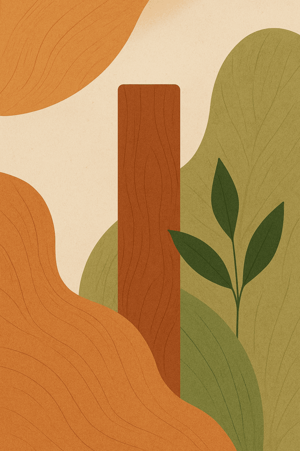
Option 2: Natural Warmth
Prompt
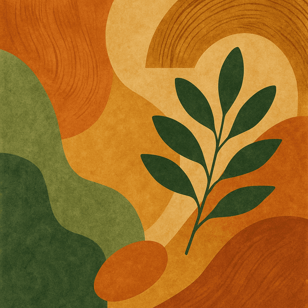
"Abstract illustration for a natural, warm, and inviting design. Incorporate earthy tones like oranges, browns, and greens. Use organic shapes and textures reminiscent of wood grain and foliage. The style should feel grounded and approachable."
Option 3: Vibrant Playfulness
Prompt
"Abstract illustration for a vibrant and playful design. Use bright, contrasting colors (pinks, purples, yellows, teals). Incorporate dynamic, fluid shapes and a sense of movement. The style should be energetic and fun."
ChatGPT

Option 01
Option 02

Option 03

Manus

Option 01
Option 02

Option 03
Modern Minimalism
The natural, warm, and inviting elements, characterized by earthy tones and organic shapes, perfectly complement StudioA11y's vision of creating accessible homes that feel grounded, comfortable, and harmonious. This style effectively communicates a sense of approachability and a connection to nature, which are key aspects of their design philosophy. While the other options offered interesting alternatives, the natural warmth of the second option best captured the essence of StudioA11y's brand, ensuring visual consistency and reinforcing their commitment to thoughtful, human-centered design. This choice allows the visual identity to seamlessly integrate with and enhance the user's experience of the website, reflecting the care and consideration put into each project.
Prototyping
Phase 05
Testing AI for Concept Generation
Lovable.ai
DesignFast

Analysing Results & Prototyping


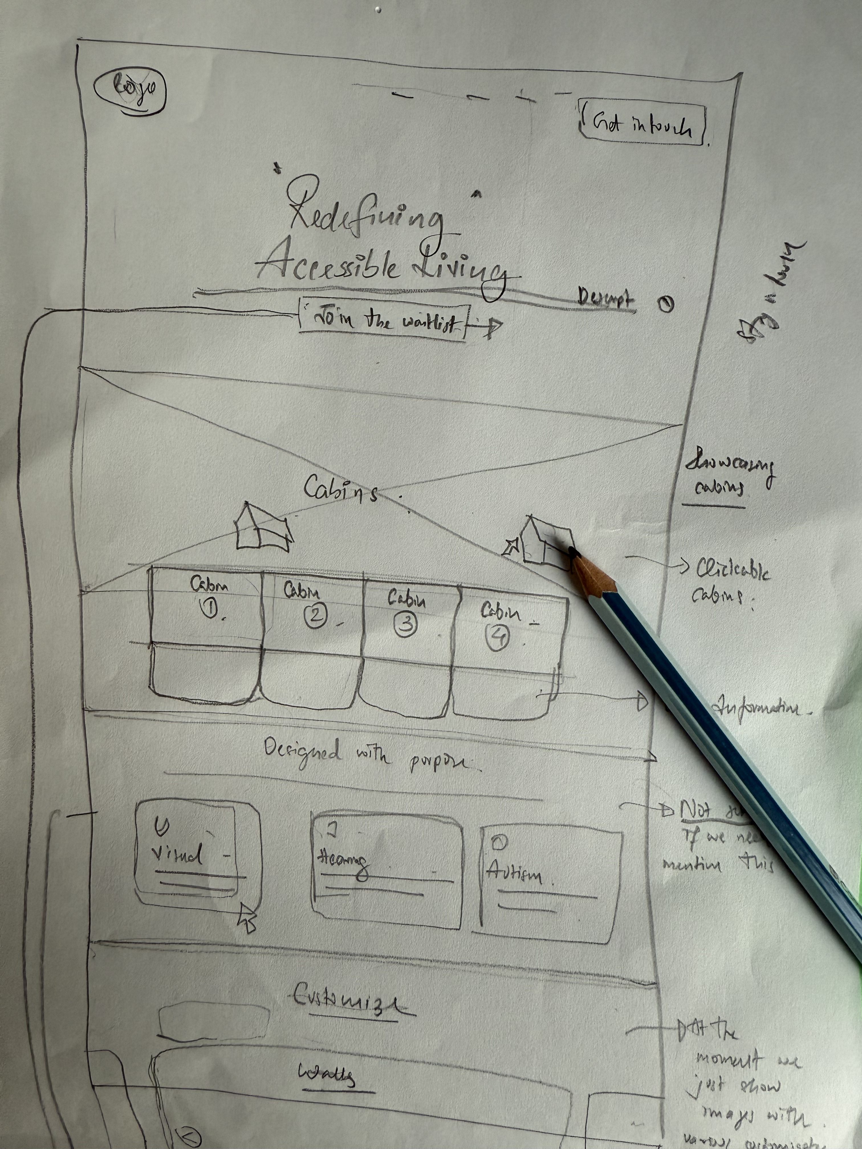
Low to High Fidelity wireframes
Starting with rough lo-fi sketches, I mapped user flows and core layouts. Mid-fi drafts refined spacing, copy, and hierarchy. High-fi frames added brand colors, icons, and interactions, leading to a final prototype for review with a UX designer and the client
Low-fidelity wireframes

Mid-fidelity wireframes

Design Process
Generating AI Landing Page Concepts
Used Lovable.ai and the DesignFast plugin in Figma to generate initial layout ideas.
Sketching on the Drawing Board
Explored layout and interaction possibilities by analyzing AI outputs.
Initial Client Discussions
Presented early concepts and clarified goals, tone, and expectations.
Developing Low-Fidelity Wireframes
Created structure-focused wireframes in Figma to map content and flow.
Testing User Flows
Walked through basic interactions to identify usability issues early.
Developing High-Fidelity Wireframes
Built polished layouts in Framer with brand elements and real content.
Review with UX Designer
Discussed layout and accessibility decisions with a UX design peer.
Basic Accessibility Testing
Used accessiBe to run an initial accessibility report and find issues.
Incorporating Feedback and Fixes
Made adjustments based on test results and UX feedback.
Preparing for Launch
Final check of responsiveness, link structure, and form behavior.
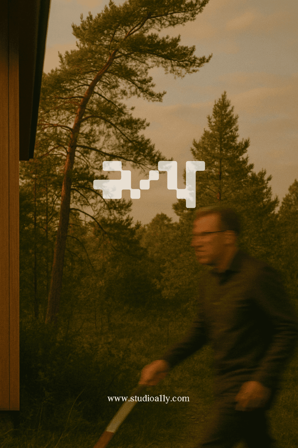
Launching the Website on Framer
Deployed the live version—StudioA11y.com is now online.
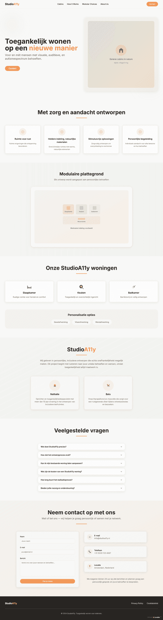
High Fidelity Design
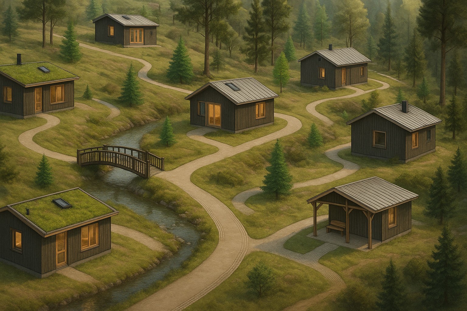
Cabin Selection Feature
This feature allows users to explore a curated list of accessible cabins based on their preferences. The design emphasizes clarity, visual simplicity, and filters for accessibility needs, helping users discover options that suit their lifestyle and comfort.
Interior Visual Options
This section presents a visual preview of key interior spaces, bedroom, living room, and bathroom through curated images. It helps users get a sense of the cabin's style, layout, and accessibility features, supporting informed and confident decision-making.
FAQ Section
The FAQ section addresses common questions related to cabin features, accessibility, and amenities. It’s designed to reduce uncertainty, support user autonomy, and offer quick clarity through clear, concise answers.
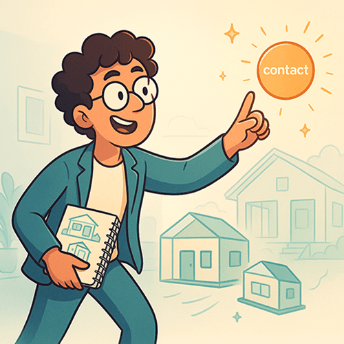
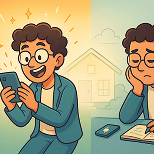
Contact Section
The contact section provides users with a simple and accessible way to reach out for more information or support. It includes clear contact details and a straightforward form, ensuring users can easily connect with the team for any inquiries.
User Engagement Analytics
The previous months analysis after 2 iterations
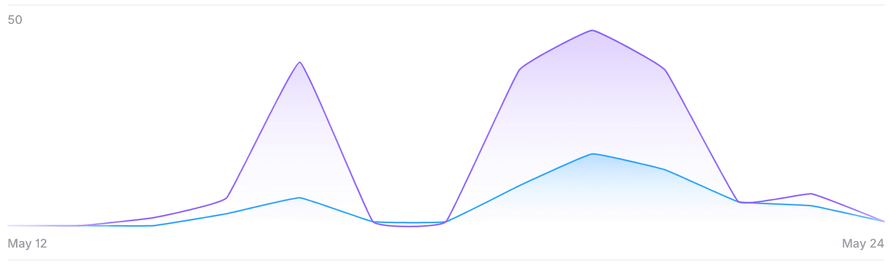
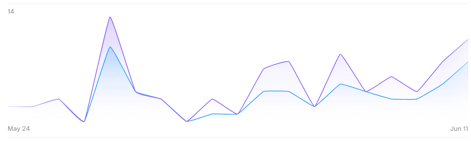
Insights
The extended session duration suggests that content restructuring and UI improvements led to more meaningful interactions.
The decrease in total pageviews suggests users were more focused and intentional, potentially finding what they needed faster.
These analytics support the idea that qualitative improvements can outweigh pure traffic metrics when it comes to delivering value and clarity.
Learnings
Process Insights
Balancing Aesthetics and Accessibility
The project demonstrated that accessibility and beautiful design are not opposing forces but can reinforce each other when approached holistically.
Value of AI Assistance
AI tools accelerated certain aspects of the process (layout exploration, content analysis) while freeing up time for deeper thinking on strategic elements.
Importance of Emotional Design
For products serving individuals with disabilities, emotional design is not a luxury but a necessity—creating spaces that feel like "home" rather than "accommodations."
Importance of Emotional Design
For products serving individuals with disabilities, emotional design is not a luxury but a necessity—creating spaces that feel like "home" rather than "accommodations."
Personal Growth
Accessibility-First Design
Deepened understanding of inclusive design principles and implementation techniques.
Strategic UX Thinking
Enhanced ability to connect business objectives with user needs through design decisions.
Design System Development
Improved skills in creating scalable, consistent design systems that balance flexibility and standardization.
Client Communication
Refined ability to translate technical concepts into clear value propositions for stakeholders.
© 2025 Balu Suresh. All rights reserved.